
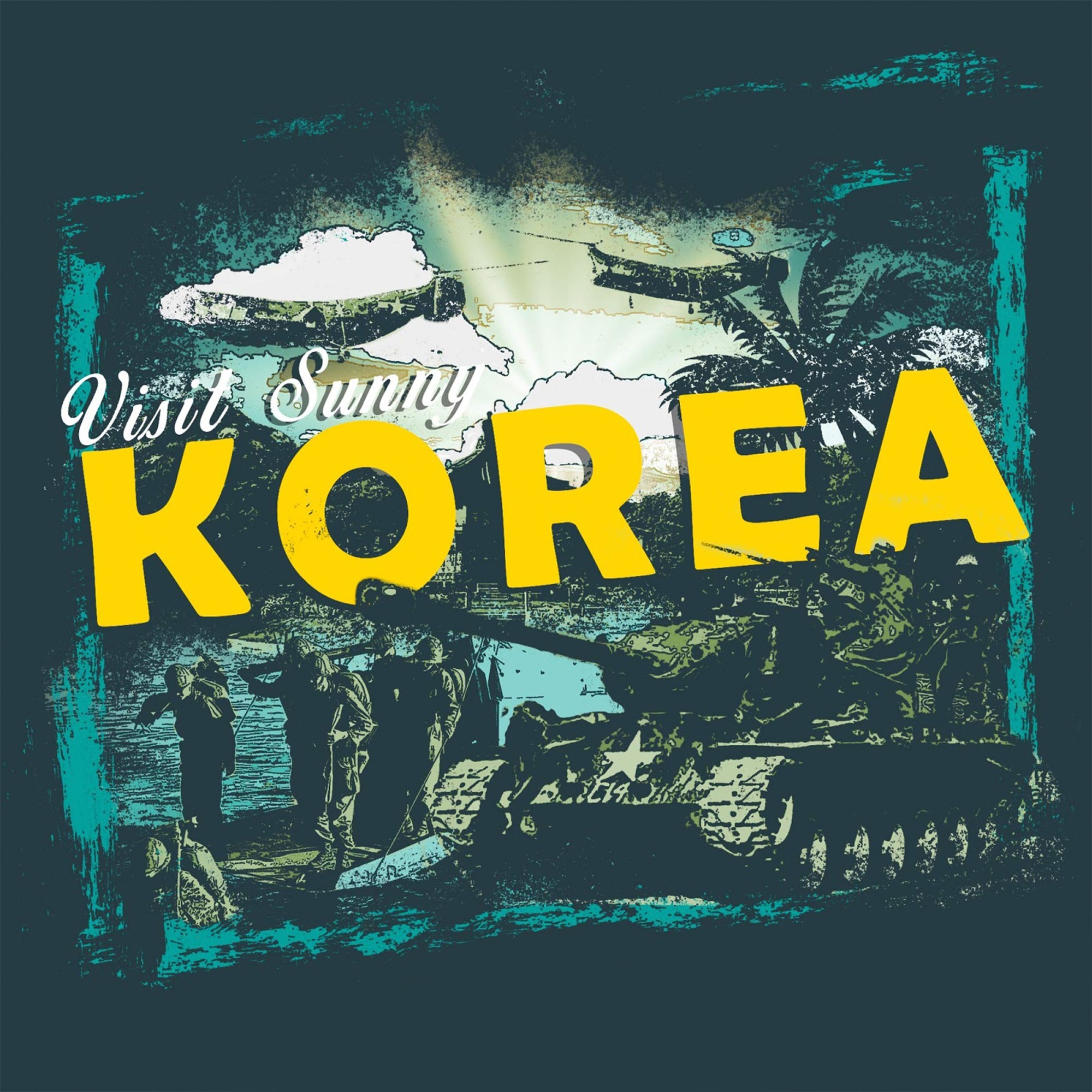
One of the biggest challenges with this design was balancing visual impact with budget constraints—we were limited to just two ink colors to keep production costs low and maximize ROI. To overcome this, a fellow designer and I strategized using color theory and halftone techniques to create the illusion of a richer color palette. By carefully layering yellow and Caribbean blue inks, we achieved a natural green overlay where the colors intersected. Printing on a dark indigo T-shirt further enhanced the depth, making the blues richer while allowing the muted army greens to stand out. The result? A deceptively complex design that felt far more vibrant than its two-color limitation.